Posted on Leave a comment

Zen Calligraphy

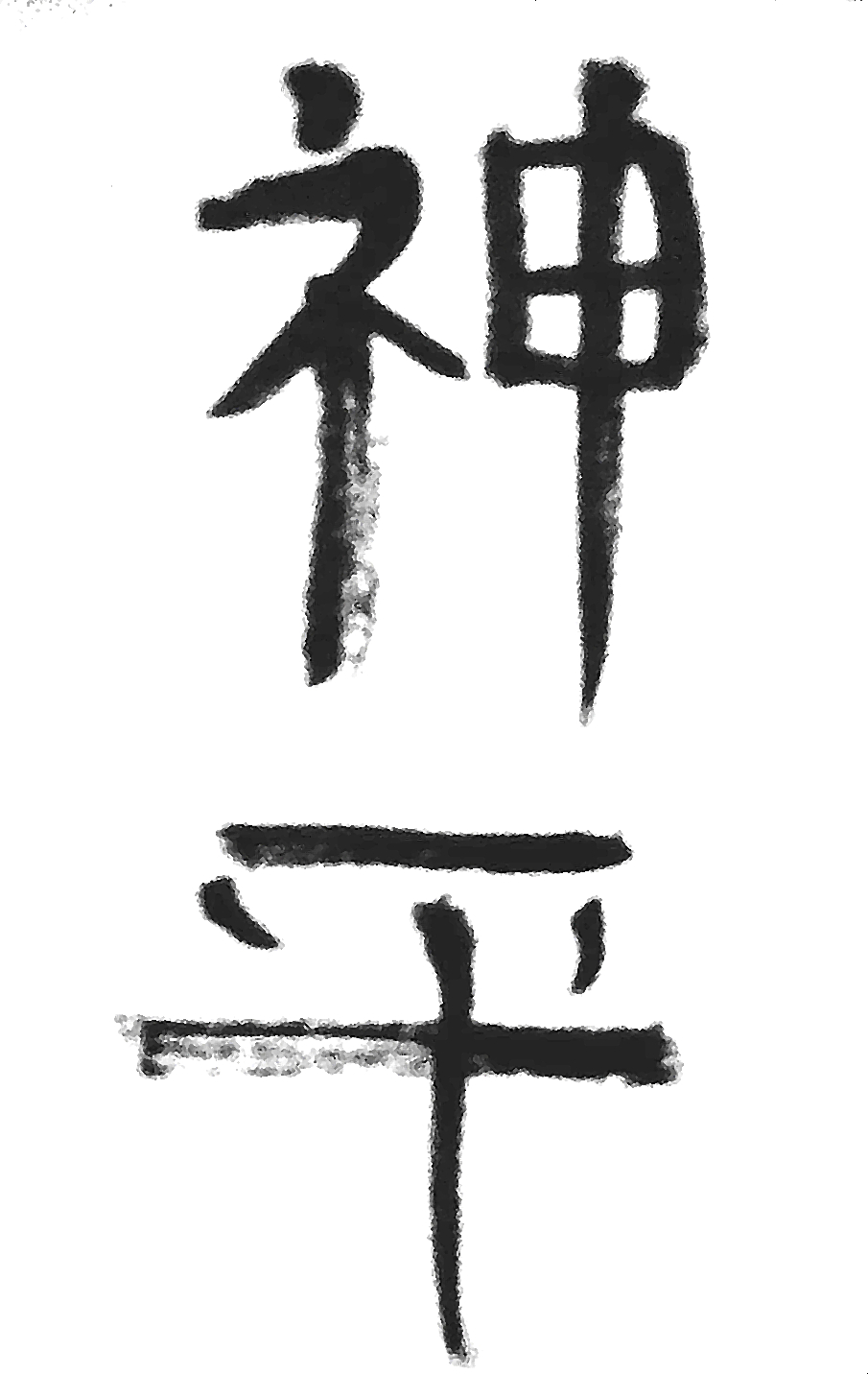
Zen Calligraphy, also known as hitsuzendo, is a style of calligraphy that does not rely on traditional calligraphic aesthetics; instead it is created by the calligrapher, who puts him or herself into a meditative state, and lets the energy he taps into, flow through him and into to the calligraphy. If this is new to you, you may be saying, “what the what?” Let me explain.enzo

First, when I say meditative state, I don’t mean like a hypnotic trance. I mean that the calligrapher empties himself (I’m going to use the male pronoun, because I am mainly speaking from my experience, but understand that this is a method that women use as well) of his own thoughts and opens himself to become an instrument, an extension of the brush if you will. In this way, the true Self is the calligrapher and not the ego. As this is a Japanese style of calligraphy, we will use the Japanese term Ki to refer to the energy that the calligrapher channels. This energy can be seen in the powerful and free look to the brush work.zen tiger

This calligraphy was developed by Zen Buddhist monks and is itself a form of meditation. Traditionally, the work consists of a Japanese word or phrase, but can also be a picture or an abstract brush stroke. Once the method is understood, the practitioner is not limited to Japanese calligraphy, but can use the method in any art form. Indeed, Zen masters explain that there is no difference between “shodo” the way of the brush and “kendo” the way of the sword.faith

I have begun to apply the method to Sanskrit calligraphy. In Sanskrit, Ki is Shakti. Both words refer to the same energy that permiates the cosmos, and gives us life. It is everywhere and everything is made of it. It creates, sustains and will ultimately dissolve the universe. In India, Shakti is worshiped as a goddess. The awakening of this energy and connecting with it is known as kundalini yoga.devi

Posted on Leave a comment

Sacred Calligraphy Blog #1

It’s 2016 and like many people, I have decided to use this landmark to focus my efforts personally and professionally. To this end, I have decided to concentrate more on meditation and trusting in God this year. Professionally, this translates into focusing more on sacred calligraphy. While I have been doing this for years, I feel that I reached a turning point last year, in making the calligraphy more of a personal expression. This has always been my goal, but at first, I was so worried about getting the letter forms correct, that what I was doing could be better described as hand lettering.

My training for this is particularly unique. Many people study calligraphy, many people study typography, and many people study sacred languages. (Actually, in all three cases, many is a relative term; these are rather specialized fields of study) While there is no doubt some crossover in these three areas, the Venn diagram (imaginary in this case, as I am too lazy to actually research the numbers to make my point) is smallest in area where all three fields of study converge.

In this blog, I will talk in detail about the meditative quality of various methods of sacred calligraphy, the difference between how I approach different styles and different languages, as well as what makes for a good word or phrase. People have been doing this for thousands of years in every culture known, so there’s lots of room to study past masters. Be sure and let me know what your interested in, and if you do sacred calligraphy what your approaches are.

img005 krisnaEPSON011 (2) img014 omEPSON007I focus mostly on Sanskrit for my calligraphy. I’m basically learning Sanskrit one sacred word at a time. Sanskrit was developed specifically to record the Vedas, the sacred scriptures of India. There is also Tibetan Sanskrit, which is related, but not the same as the Vedic Sanskrit I focus on. The letterforms of the language are known collectively as Devanagari. There are plenty of Sanskrit scholars who know more than me and Vedic scholars as well. I do not claim to be the foremost authority on these subjects. I do not claim to be the best calligrapher in the world. I think you will find my approach fairly unique, although I don’t think I’m the only one in the world doing what I’m doing. I also am learning Zen calligraphy, which I freely adapt to the various languages as a style while also learning the more straight forward methods of kanji calligraphy. I have also done Hebrew calligraphy. I have done all of these professionally, and am going to expand my repertoire this year. Perhaps I will learn Tibetan Sanskrit and maybe some Arabic.  I can only promise it will be an adventure.

Posted on Leave a comment

Hamsa Sanskrit Calligraphy

img012

This Handpainted Sanskrit Swan Hansa Calligraphy on Himalayan paper depicts a pictogram of a swan above the Devanagari Sanskrit letters spelling “Hansa” the Sanskrit word for swan. The swan is a Hindu symbol for enlightenment and transcendence. The word “Hansa” is also an ancient Mantra wherein one inhales “Han” or “Ham” and exhales “Sa” This is also known as the “So Ham” mantra.
Painting is approximately 6×8 inches.

$30 plus shipping


Posted on Leave a comment

Krishna Sanskrit Zen Style Calligraphy

krisnaEPSON011 (2)

Today’s offering in Sanskrit calligraphy is Krishna. The star of the Bhagivad Gita, and the most popular god in the Hindu pantheon, this avatar of Visnu is seen as the supreme personality of the godhead by worshippers around the world.
This rendition is executed in the zen style of brushwork, meant to infuse the piece with energy.
$30 plus shipping


Posted on Leave a comment

Shakti Celestial Mother Goddess Print

aditi 001.jpeg

This primordial goddess of creation is spoken of in the holy Vedas. She the boundless infinite from which sprang all that is. She is the source, the Mother of all. Here she lays on a a celestial bed surrounded by the universe she brought into existence.
This is a digital reproduction of an original watercolor. Print is 8×10 on rives bfk printmaking paper.

$30 plus shipping

To purchase click here.


Posted on Leave a comment

Buddha Zen Style Sanskrit Calligraphy

buddha2EPSON005

The Sanskrit word “Buddha” is rendered in blue lightfast, permanent ink with traditional sumi brush on rice paper. Usually reserved for Kanji, the Zen style of calligraphy calls for the calligrapher to empty his mind and become a vessel for the universal life force or chi to flow through him, guiding him as he renders his work. This process imbues the work with vital energy.
This piece is aprox 9×12 and is the perfect addition to your yoga space, meditation area, home or office.
The word Buddha means “awakened one” or “the enlightened one”. “Buddha” is also used as a title for the first awakened being in a Yuga era. In most Buddhist traditions, Siddhartha Gautama is regarded as the Supreme Buddha (Pali sammāsambuddha, Sanskrit samyaksaṃbuddha) of the present age.Gautama taught a Middle Way between sensual indulgence and the severe asceticism found in the śramaṇa movement common in his region. He later taught throughout regions of eastern India such as Magadha and Kosala.
Gautama Buddha, also known as Siddhārtha Gautama, Shakyamuni, or simply the Buddha, was a sage on whose teachings Buddhism was founded. He is believed to have lived and taught mostly in the eastern part of the Indian subcontinent sometime between the sixth and fourth centuries BCE.
source: Wikipedia

$30 plus shiping


Posted on Leave a comment

Monotypes.

Lately I have been doing a lot of monotype prints. I purchased a gelli plate a while back and I’m trying to get the hang of it. I’ve taken about four semesters of printing when I was in college; one in J.C. was an introduction: letterpress, offset, relief, serigraph, that sort of thing. Then, at Art Center I took printmaking twice and a class focused on letterpress. The into at J.C. was focused on preparing us for working with presses in publishing; strictly commercial stuff. It was the late ‘80s and the same teacher also taught desktop publishing. There were several presses in the shop and I remember the offset press the most. It’s called that because the plate is forward reading, and when inked it transfers its image to a roller which is what comes into contact with the paper. I also had to create a color separation of an image by hand. I picked a picture of a friend of mine. We cut out cyan, magenta, yellow and black transparent acetate images and when they were laid on top of each other they made a full color picture. Mine came out pretty good.

The letterpress class was a logical extension of this. We set type by hand. I made a book of my poetry, illustrated by linoleum block prints I made for them. I bought bookbinding materials including hardcover bookcloth that I got from a special store in L.A. and bound several copies for people for Christmas that year. I was really proud of them. It was a lot of work. Like many professionally handmade things, they come out looking like they were made by a machine and people never realize how much effort went into making them.

The printmaking class was about the art of printmaking. Stone Lithography, etching, drypoint, aquatint, things of this nature. I loved it. I wrote a short story for a friend whose father had died, as a way of trying to comfort her. I illustrated it and gave it to her as an unbound folio. That was the second semester. The first semester was the stone lithography (which was pretty hard, no pun intended. I don’t know how Mucha did mulitcolored prints, but that was the process in those days. I did aquatints of the holy grail, and some other things that were of no consequence. For the illustrated story the second semester, more aquatints (the story was Marina about the life of a raindrop and aquatint was perfect) the text was a photo etching of plate made from high quality prints onto acetate.
Since then, linoleum prints have become a part of my regular artmaking process, I haven’t done etching since school because it requires a press (I use a rolling pin for the lino prints) and acid baths and resin and I don’t have the space for that right now. This gelli plate doesn’t require a press either and I thought I knew enough about printmaking to give it a go. It’s soft, so it’s easy to print on and then can be cleaned and used over and over again. Because it’s soft, you can’t use hard tools to scribe, but there are plenty of soft tools to use nowadays.

Most of my prints are fairly abstract, which is ok with me because I love abstract art. You can use any kind of paint or ink and most of the info I’ve seen suggests acrylics because it’s fast drying and can be cleaned up with soap and water, and then is permanent when dry. I like Golden Open the best because it dries slower allowing for more clean up time. However, most of the acrylics I have are not Open, because for painting with acrylics, I prefer creating several layers very fast. This is also why the gelli plate is good for acrylics. It’s very hard to get a good monotype from one layer, but several can create really interesting textures.
I usually run sets. I do several prints with the same base color, then by the time I’m done, the first print is dry and ready for the second layer, and they I run through layer after layer until I have several prints that have been through the same process. The prints are all original however as any image has to be created from scratch and the plate is inked each time. It’s a learning process for sure. My latest batch is a group of winter nocturnes that look kind of like Rothko’s and that’s ok with me.

Posted on Leave a comment

Influences

This blog was originally posted at my website, here: http://www.zhibit.org/azulbluedragon/blog/influences

I was sitting at home the other day looking through some of my art books. I have a giant Degas book that was a gift from my parents, that came from the Norton Simon Museum (the book, not my parents.) I love Degas and the way the application of chalk or paint (he can do both with equal effectiveness) can communicate the transitory quality of a fleeting moment. It adds an intimacy to the piece as if we were there as the washerwoman yawns while she works (presumably from being overworked and raising a family)

This quality, as well as his use of cropping the frame like the relatively new medium of photography, incorporating patterns in a similar fashion to the Japanese wood block prints that were popular at the time, and employing as subject matter, working class women (instead of upper class subjects or religious or classical subject matter that pervaded previous art genres) are indicative of post impressionism, that includes Degas’ contemporaries, Van Gogh, and Cezanne, as well as the original impressionists Monet, Manet and their buddies.
But my work doesn’t really look anything like Degas’.


I do use women as subject matter, but I look for what I believe would be strong women role models for a future daughter. I believe that our culture has a deficit of depicting strong women role models and I want them to be there for my daughter if and when she is old enough to look for them. There are plenty of women for her to look to, but they are not commonly depicted in popular culture. This is part of a vicious cycle where women remain in the minority of leadership positions or few are considered cultural heroes, and so girls grow up thinking that the best option is to get married and have babies, (which is of course an option, but women should have more choices. that’s the point.) In any case, as an artist, I make the conscious decision to promote strong women role models.
This is a big enough subject that is should have its own separate blog post, so I won’t say anymore about it here.
Back to influences.


I have always cited Michelangelo & Da Vinci as huge influences, and I really love their work; especially the Pieta and the Madonna of the Rocks. I love Leonardo’s use of Chiaroscuro and the glazing techniques that combine to give depth and texture to the beautifully rendered figures. I love the way that Michelangelo poses and renders his figures. These poses are a precursor to Mannerism.
My work doesn’t look anything like these guys’ work.
 

I also love Rembrandt, & Rothko, Homer, Hopper, Franz Kline, Sargent, Courbet, & many many others. I love illustrators like NC Wyeth, Arthur Rackham, Leyendecker, Rockwell, Frazetta, Lee, Gorey, and many many others. My first influence was Charles Schutz. Then came my love for comic books; Spiderman, Batman, Xmen, etcmen… Maybe I have so many influences that it’s hard to discern any single one. Maybe I’ve been drawing and painting for so long that I’ve developed my own way of doing things. Maybe I’m such a crappy artist I can’t even copy my heroes very well.